Wednesday, February 5, 2014

Warm and Cool Weaving

In kindergarten and first this year I taught a weaving using warm and cool colors. I explain to students that a weaving goes "under and over." I also tell them to pretend that the strips of paper are hungry. You have to open their big mouths (lift the strip up) and the other strip going in is the food. It kind of helps them with the "under" part. This is their first weaving so spaces are left in between strips to make the weaving process easier. I also don't have them go over/under every single strip. I tell them to pick a color and weave under only that color. Then change colors for the next strip of paper.


Materials:
  • 12x12 black paper
  • warm colored 1" strips of paper
  • cool colored 1" strips of paper
  • glue
Procedure
  1. Day one: Introduce the art of weaving and discuss warm and cool colors. Glue cool colored strips of paper in one direction onto the black paper. Only put one dot of glue on each end of the strips, otherwise your students' weaving will fail miserably. Remind them, "just a dot, not a lot". They love that. Or, you can even sing, "A little bit of glue, a little bit of glue, a little bit of glue will do." You can't really get 5 and 6 year olds to do much without a song or rhyme of some sort :)
  2. Day 2: Cool strips are dry, yay. Weave warm strips into blue strips. Focus on just one color each time. 
That's all! Enjoy. -Miss S


Henri Matisse Inspired Goldfish Still-Life

In 6th grade this year I taught my students about Henri Matisse and his still lifes. This is my first year teaching middle school so I had no idea what to expect..... I love how they turned out. You can DEFINITELY notice at this age who really has that natural artistic ability.  
Materials:
  • 12x18 white paper
  • pencil
  • black fine point sharpie
  • watercolor paints
  • water
  • paint smock
  • examples of Henri Matisse's art
  • a still life for students to look at (I put a fish bowl, a flower, some fruit, and a mug onto a table)
Instructions:
  1. I had students practice blind contour line drawing before this. They actually liked it!
  2. Teach students about Henri Matisse. I made a powerpoint on the guy and pointed out his use of colors, and patterns/designs in backgrounds. Some students even added a window in the background like he has done in several paintings. 
  3. Students referred to an empty bowl of water on a table with several objects. Students were allowed to add imaginary objects or remove objects in their drawing. Students had to imagine their own fish because all my goldfish had died.... whoops.
  4. When it came to painting I had them use a lot of water and wet-in-wet inside the fish bowl to make it look like it really had water in it. 
Sixth grade success! 

Proportions of the Face

In 4th and 5th grade we learn the proportions of the face and make a self portrait with pencil. When working on our self portrait, we discuss shape, proportion, balance, symmetry, texture, and value.


I have a handout I give to the kids to help them draw their face. I honestly DO help a lot on this one, especially with the blending of the tones on the face. 

Watercolor Leaves with Textures

This is a new lesson this year I taught in 4th and 5th grade. I was inspired by a piece I saw on Pinterest, that I think was actually geared towards middle and high school artists. With this lesson students combined the elements of art: visual texture, positive and negative space, line, shape, and color, as well as drawing and watercolor techniques. 
This student chose the technique of "wood" and did analogous colors: green, blue, violet. 
This student chose the technique of "circles or bubbles" and did the same color scheme. 
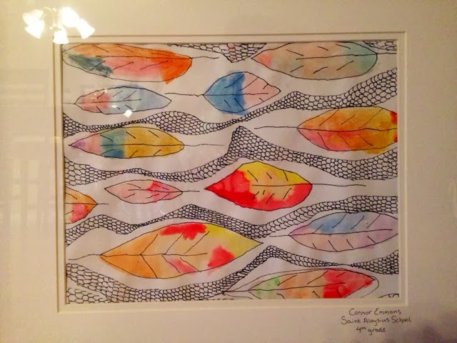
This student did the texture "scales" and did not really follow a color scheme. But I still liked it so much I had to frame it. I guess the lesson learned here is... don't always do what the teacher says. No, no, no! That can't be right..... ;)

Materials:
  • 12x18 white paper
  • pencils
  • black fine point sharpie
  • watercolor paints
  • paint brushes
  • water
  • handouts with examples of visual texture
  • paint smocks
Instructions:
  1. First we review the elements of design, particularly space, line, texture, shape, and color. I teach students how to draw a simple (organic shape) leaf, which we do several times in pencil. Leaves should NOT overlap. 
  2. Trace around leaves leaving a small amount of space so that it appears the leaves are in a bubble. I told students that they could make the bubble go around surrounding leaves. 
  3. Go over pencil lines in sharpie and erase all pencil lines. 
  4. Give students examples of how to draw different textures. Students should fill all the negative space with one texture. This took the most time, probably 2-3 class periods. Some students made the mistake of filling the bubble around the leaves with the texture, so just watch them closely and remind them that they want a nice white bubble around their leaves to make them stand out.
  5. Last, students will fill in each leaf with an analogous color scheme. I had students choose 3 colors and write them down in pencil on the back of their paper so not to forget.  
One of my students did not follow directions, but I actually LOVE the way it turned out. I think he did whatever color he wanted. I can easily see this resulting bad for some students because their colors might mix and create a grey or brown color. Next time I do this I may allow students to choose their colors and just enjoy experimenting with the wet-in-wet technique. They really thought it was neat!


Saturday, February 1, 2014

Monarch Butterflies Paintings.... Again!

I came across this lesson idea in an Arts & Activities magazine a few years ago and have been implementing it ever since with my third graders. Here are some photos and a more detailed write up from last year. My students love learning about how the butterflies fly to Mexico.

Negative Space Initial Designs

Positive and negative space initial designs is a 2nd grade favorite! Be ready to have a lot of dye-cut letters for the kids to trace.

Georgia O'Keefe Flowers

Third graders used oil pastels to create these beautiful O'Keeffe flowers. I am thinking about doing them again this year, and possibly having 4th and 5th grade explore some of her bleached bones paintings. What do ya think?


Kandinsky Mixed Media Paintings

I love these Kandinsky paintings and all the possibilities!! Hopefully I will be able to fit them into the curriculum this year, but mine is just packed with new ideas! 4th graders used just about every medium they could get their hands on for this one. Here are some close-ups of a few favorites.


Is that the most artistic floor you have ever seen, or what ;)

Pointillism Projects

Check out these pointillism projects I have done in the past with students. I love connecting art projects we do to famous artists. This one is obviously very easy to connect to Seurat. The balloons were done in my 4th grade class at Ball Chatham Elementary. We did a watercolor wash in the background before we added dots with crayola markers.

This year at I did a pointulism project with kindergarten in the fall. We used Q-tips and tempera paint for the dots. I am planning to do something similar with my second and third graders, but a different subject.